

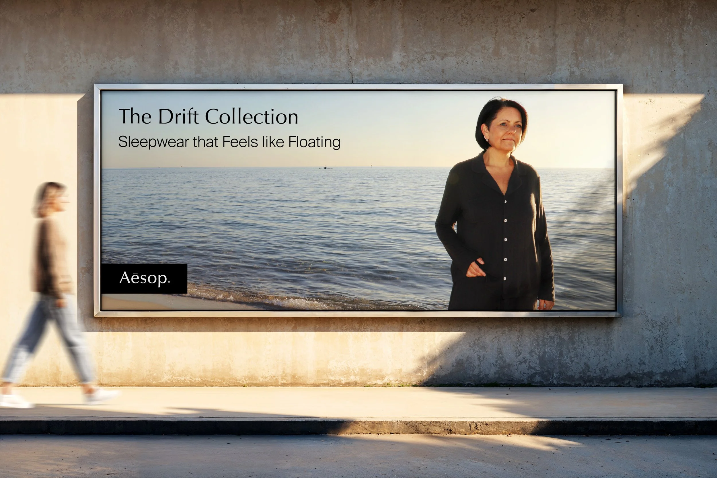
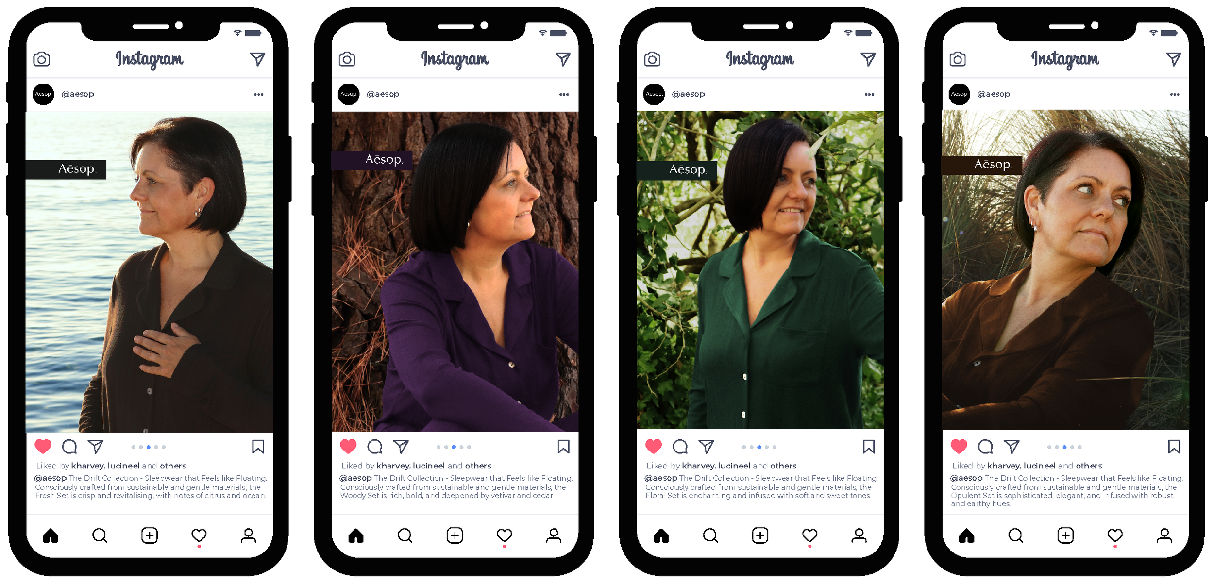
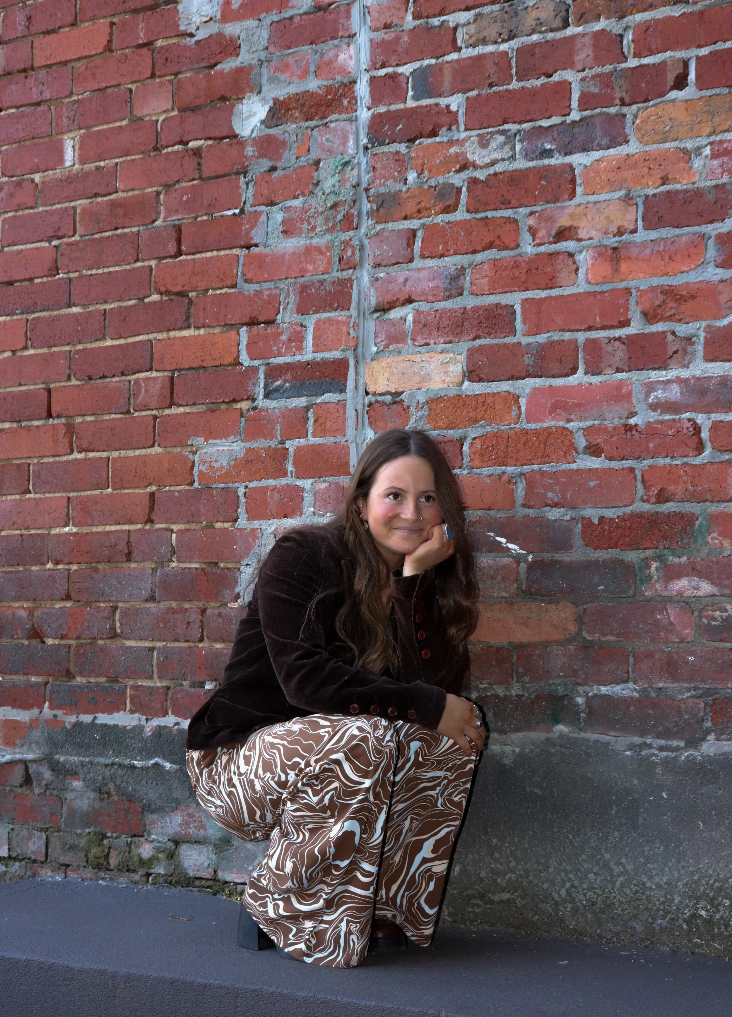
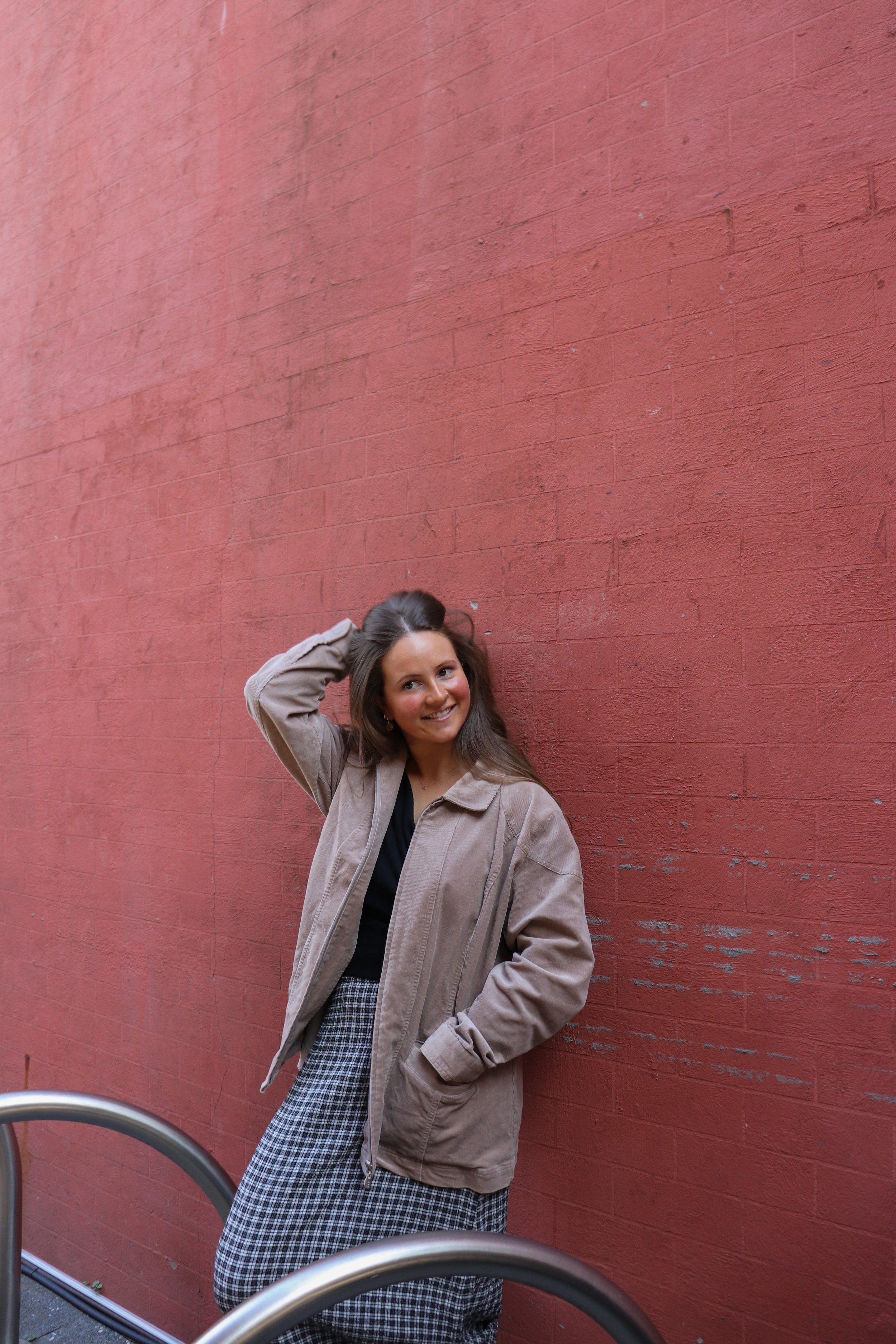
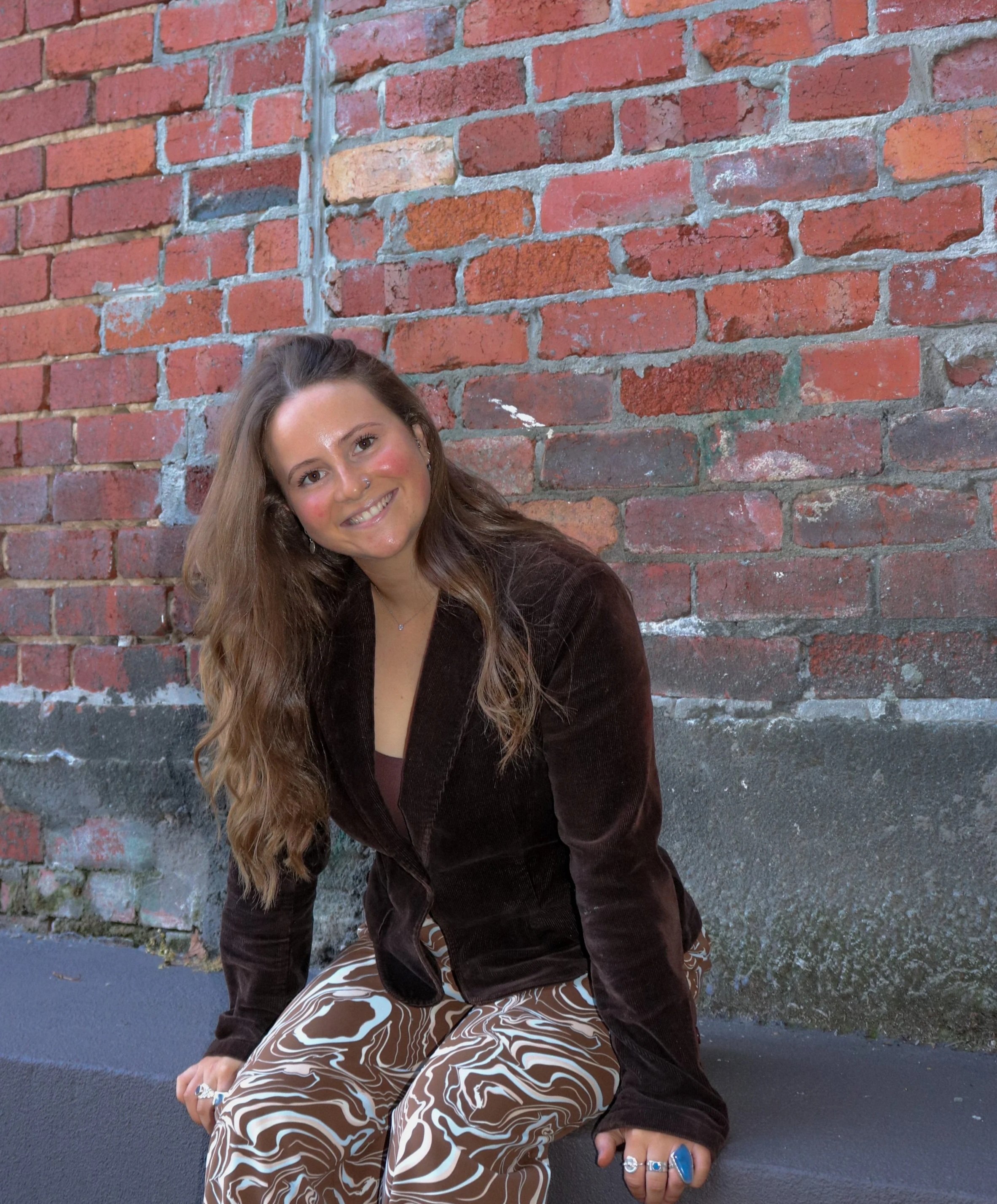
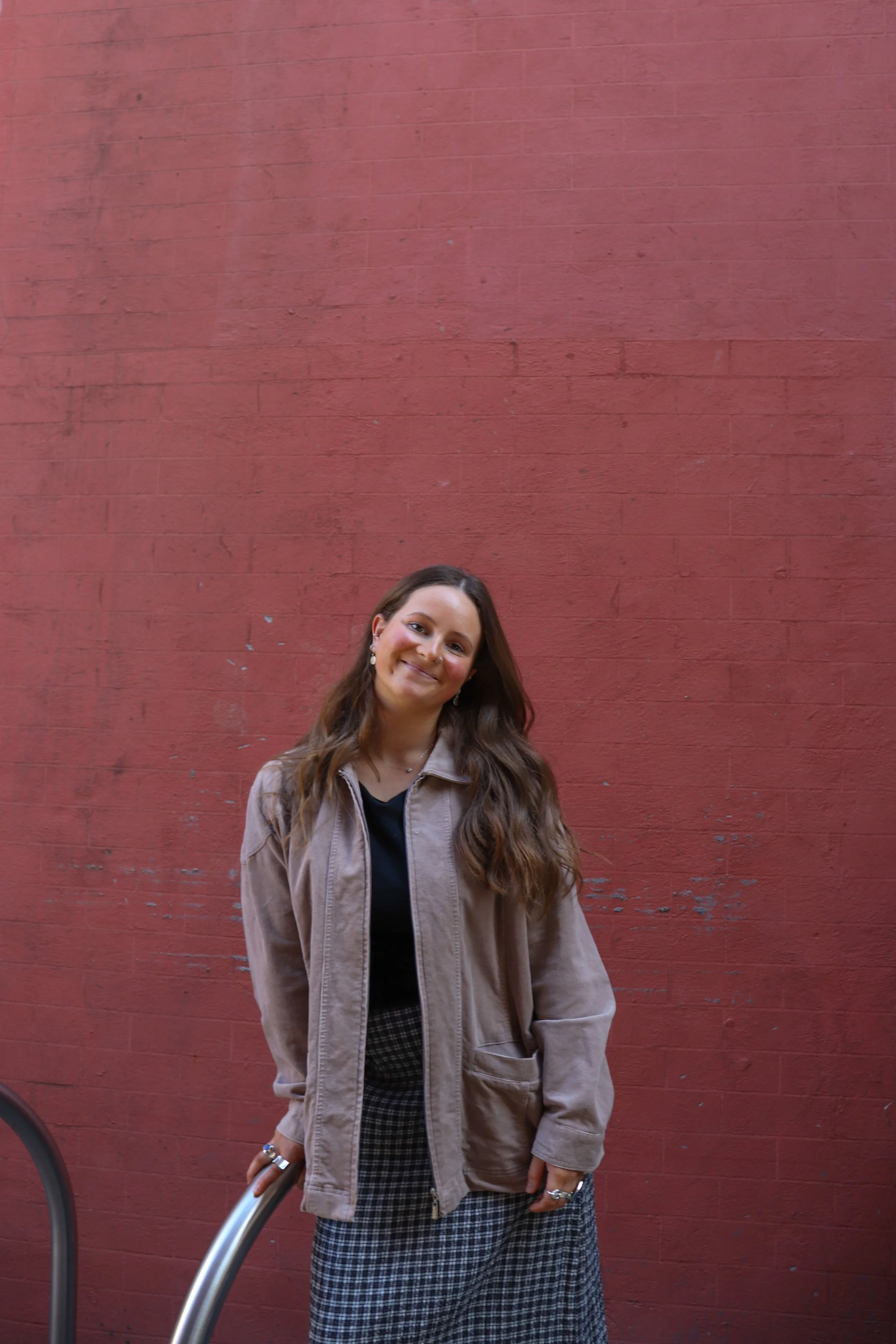
Aesop – The Drift Collection Campaign
Creative Direction | Graphic Design | Campaign Strategy | Photography
Project brief
Develop a product range and complementary advertising campaign for Aesop that attracts a new consumer category and drives sales.
Rationale
The Drift Collection introduces a dreamy sleepwear range that extends Aesop’s brand, attracting consumers with a tranquil, immersive routine that pairs sleepwear with skincare. Each set – Floral, Fresh, Woody, and Opulent – aligns with existing fragrances, reinforcing quality, sustainability, and the brand’s signature sensory experience.

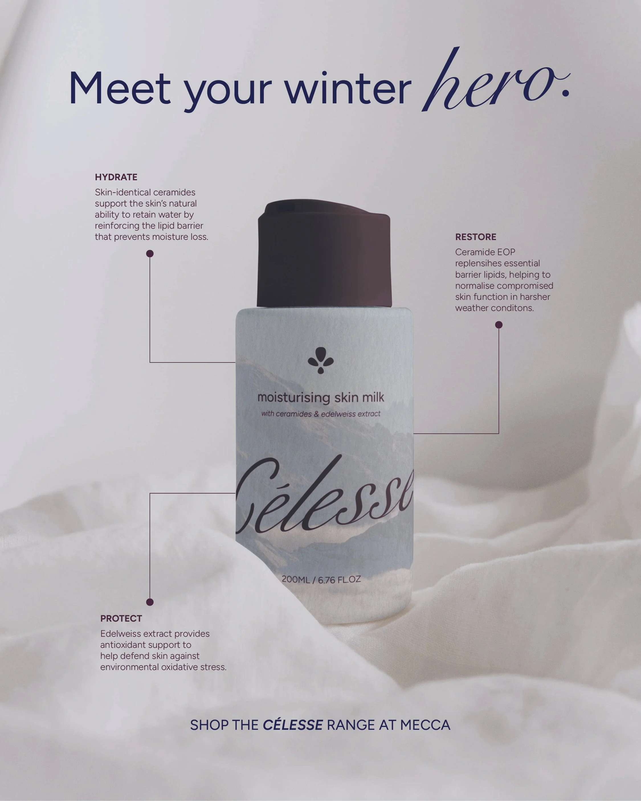
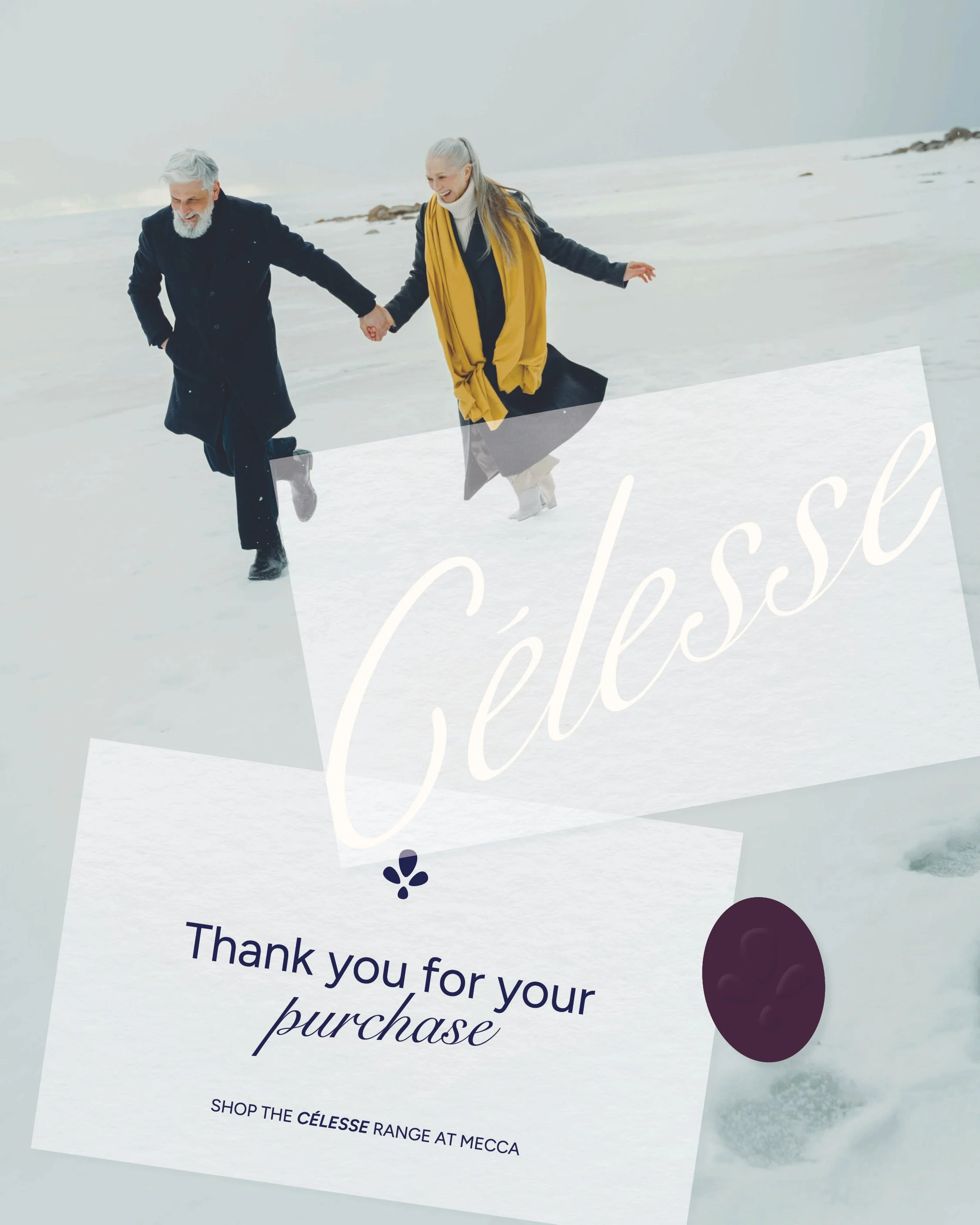
Celesse Brand Identity
Creative Direction | Graphic Design
Project brief
Develop the visual identity and packaging for Célesse, a high-end skincare brand focused on protection, and hydration. The main product is a winter moisturiser that soothes and creates a barrier to protect skin from the cold, leaving it soft and smooth.
Rationale
Combining fluid forms and crisp imagery, Célesse welcomes audiences into a safe haven amongst the chaos of winter. As a luxury skincare house, products are your hero in cold and unforgiving months. Célesse elevates daily routines with protective, hydrating and restorative ingredients that allow your skin to breathe, symbolised with elegant typography, a refined colour palette and negative space.
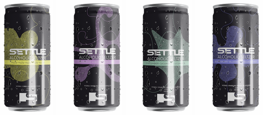
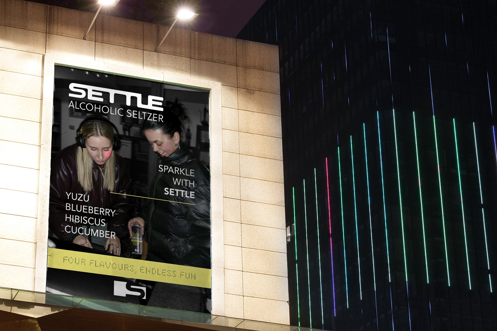
Settle Seltzer brand identity
Graphic Design
Project brief
Build a brand identity for an alcoholic drink company that targets edgy, alternative adults in their mid-20s living a fast, urban lifestyle. The goal is to build a visual tone that feels alternative, confident, and culturally aware — resonating with audiences who value individuality and aesthetics.
Rationale
Settle’s brand language juxtaposes organic shapes with bold typography to assert a sense of individuality and intrigue. Each flavour correlates with a distinct combination of colour and form, embodying a specific emotional and sensory experience. Further, concrete textures make subtle nods to the hustle and bustle of a city lifestyle and further connect to grungy audiences.
annelise marie brand identity
Creative Direction | Graphic Design | Photography
Project brief
Build a distinct brand identity and provide a comprehensive image suite for singer/songwriter Annelise Marie. The brand and photographic direction must communicate her individual style and stay true to her existing music.
Rationale
Annelise Marie’s visual identity asserts a distinct warmth and charisma that complements her music. Soft curves and sweeping letters invite listeners into her calm, melodic world whilst also introducing spunk and a playfulness that remains memorable across touch points.


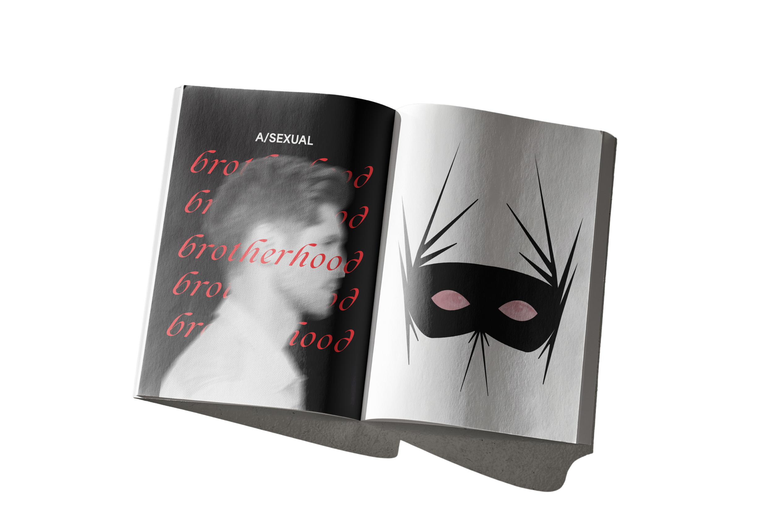
Restrictive Realities Publication

Graphic Design
Project brief
Design a publication based on Benzhi Zhang’s article ‘The Cultural Politics of Gender Performance’ that explores and expresses the themes of the text through the use of sophisticated visual language strategies from both functional and expressive perspectives.
Rationale
The publication Restrictive Realities visually explores themes of gender performance through expressive form, colour, and texture. Layered opaque pages and mask illustrations reveal symbols of secrecy and hidden identity, blending functional design with emotional depth.


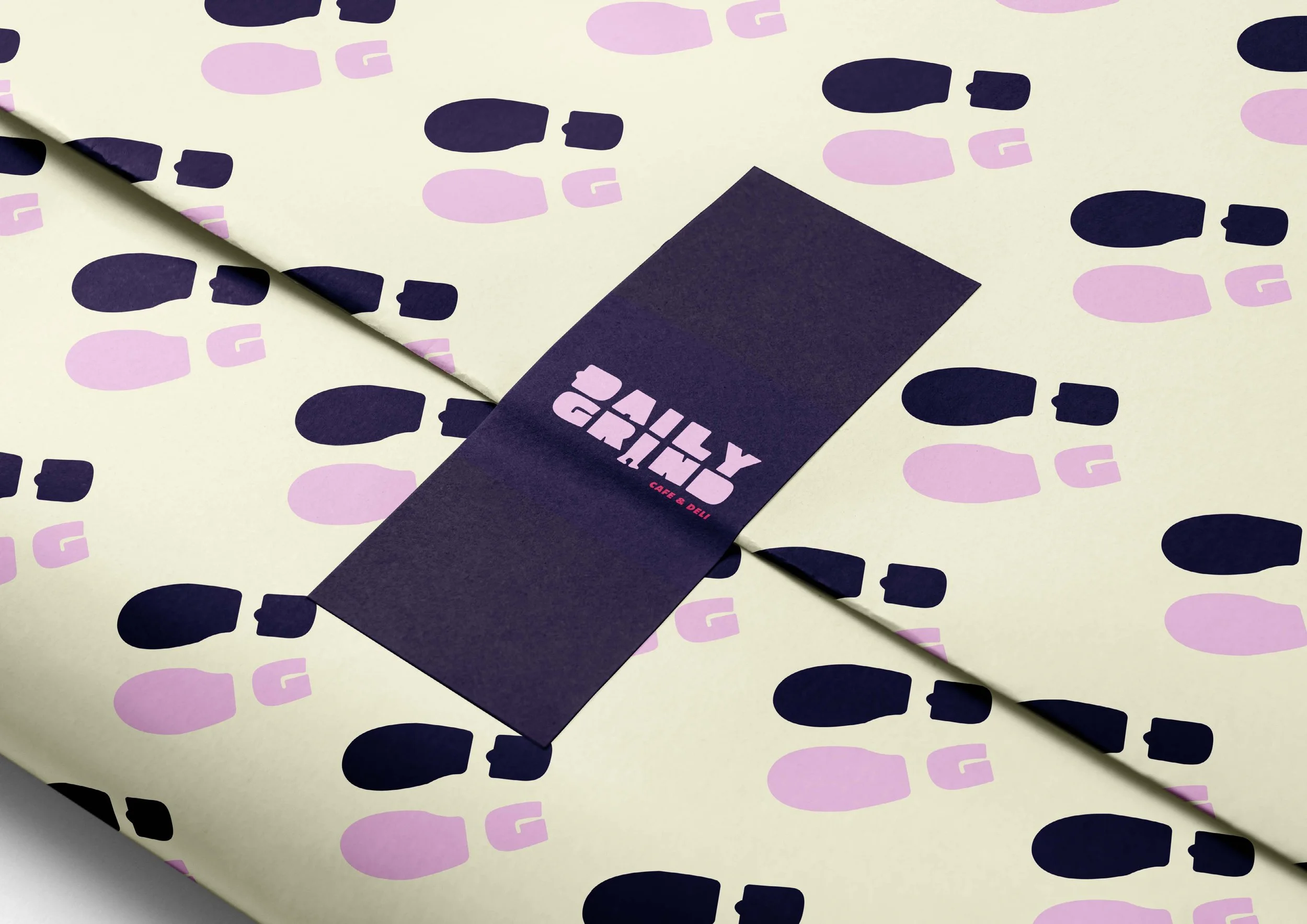
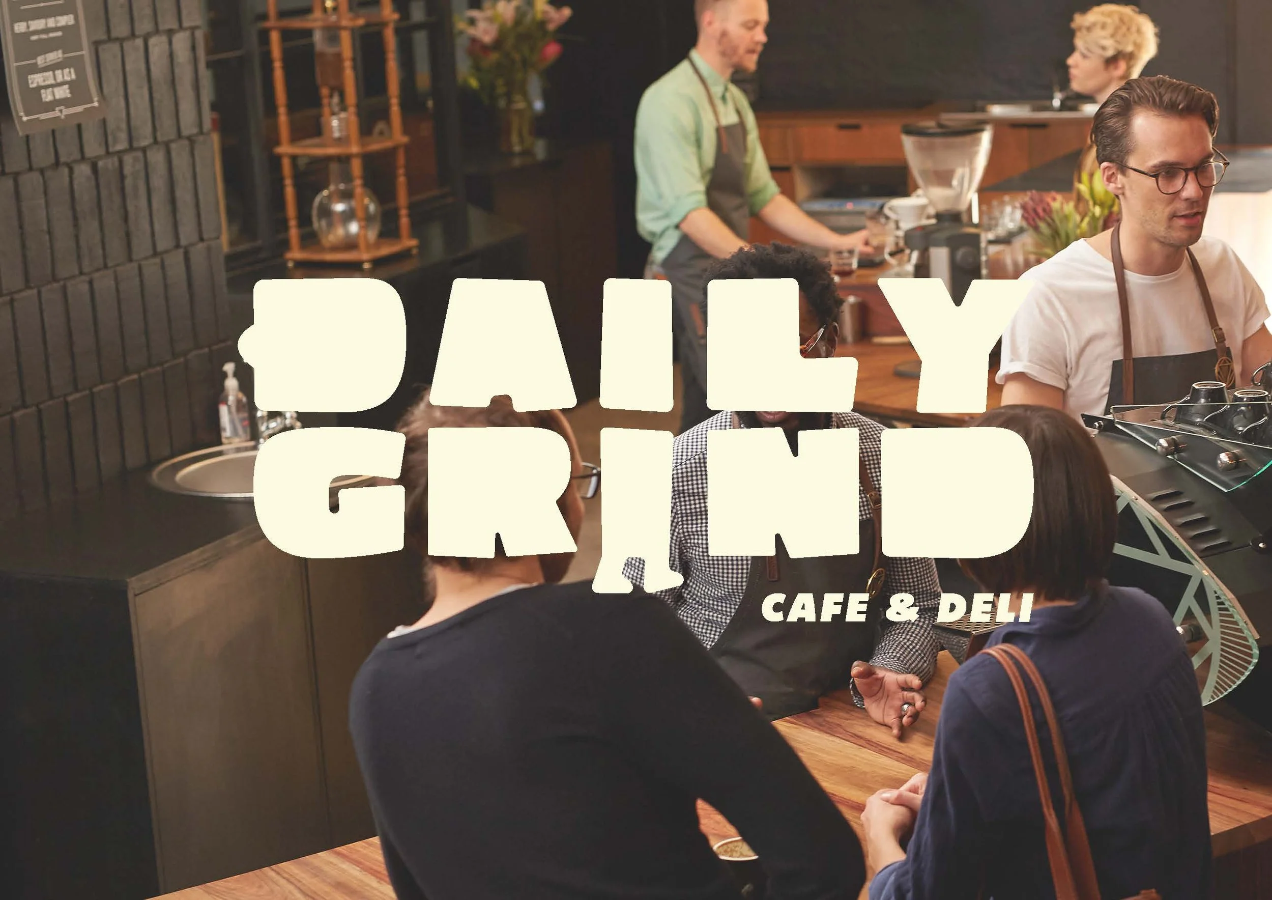
Daily Grind brand identity
Graphic Design
Project brief
Develop a strong visual identity that is both commanding and approachable. Create a unique brand language for the cafe and deli that is distinct, modern and innovative, with a playful twist.
Rationale
Daily Grind’s visual identity strikes a balance between authority and warmth, combining bold typography with dynamic and playful motion elements. The brand tone mirrors the rhythm of city life – modern, inviting, and exciting – consistently drawing customers back for their daily grind.


Imagine Festival brand identity & Publication
Creative Direction | Graphic Design | Photography
Project brief
Design a printed multi-page guide on a fictional festival event of your choosing. Make design decisions based on preliminary research and document your typographic and design layout trials. Chosen Topic:
Art & Crafts.
Rationale
The brand identity and publication for Imagine bring the event to life with a playful, illustrative tone that captures the spirit of creativity and expression. Organic shapes, vibrant colour, and expressive typography immerse attendees in a world of imagination.


